In my free time, I am the CEO/Grant Writer/Designer for a lovely nonprofit known as
. It's a 501(c)3 based in Los Angeles that focuses on bringing literacy to underserved populations. I wear a lot of hats, but one of the more fun ones is designer. It can also be the most difficult however.
One of the first things you learn in business class is how essential it is to build your brand. Your brand is who you are, it's how your customers recognize your products, it's what you communicate to your constituents, its multiple layers of subtext that basically advertise who you are, what you represent, and who you serve. If the hat makes the man, then the brand makes the business.
As Project Books is a young nonprofit, at this time we are going through our first proper branding phase. As if that wasn't difficult enough, large portions of our logo, colors, font, etc. were chosen before I came onboard. There was no cohesive vision for our design pieces, for instance, our logo is on the website (but not on business cards, collateral, or social media!), so we're starting from scratch!
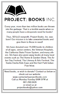
Our first order of business was creating a flyer, so this week I set about creating a very simple half letter sized flyer. We decided on black and white because ink is expensive (tiny nonprofit problems). This project was surprisingly challenging because this flyer had to be ink efficient, be the flagship for our brand, be "fetching", and broadcast our mission to the world.
So how does one go about bringing our scattered and mismatched branding together in a cost effective matter and also make it pleasing to look at?
I started with our website logo, and played around with it in Photoshop for a time. It's a pretty simple logo that was made for us for free (shout out to KHTS!).

The first thing I did was create a black version. For a time, I tried to find the font that was used but gave up after the tool I was using narrowed it down to 963 matches.
Luckily that meant all I needed to do was grab almost any san serif and most people won't be able to tell the difference. The next challenge, and the most time consuming was to figure out what the hell this flyer was trying to say. What was the purpose? What should our call to action be?
In the end, I just wrote the whole thing from scratch because the language we were using on our business plan/website/facebook page were all different and I hated all of them. So I took elements from each source and synthesized them together to make a viable message that I feel is both professional and personable. We went through something like 12 iterations before both the CEO and myself were satisfied.
My next challenge was to figure out how to make this text and image pleasing to the eye. This. Fuuuuuuuuuuuuuck this.
Since we are still working on cementing the branding, I just did a really simple basic layout.
This is our first final basic project. While I am not totally satisfied, I am moderately pleased that I managed to get it to something presentable. I took away a lot of lessons from this project, not the least was that getting this to print two to a page was ridiculously complicated for no reason. Who the fuck over at Adobe thought that putting two copies to a page in indesign and then exporting it to a pdf would force it to have drop shadows that I would have to remove IN THE PDF.
Fire that programmer.
The other thing I took away was that it is insane how different messages can be when they are referring to the same subject matter from the same viewpoint, from the same creators, to deliver the same message. It was actually difficult to combine the messages in a concise and clear format.
Anyway, for your viewing pleasure, here is the finished product. It is copyrighted to us btw.

P.S. The opening words is set to the tune of I'm Blue by Eiffel65. Shush.